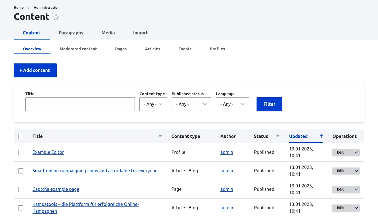
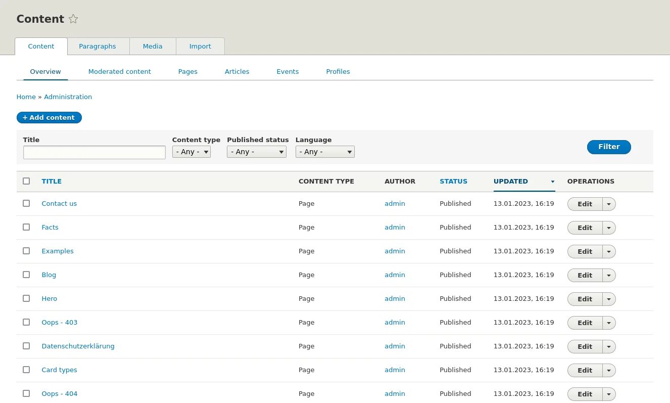
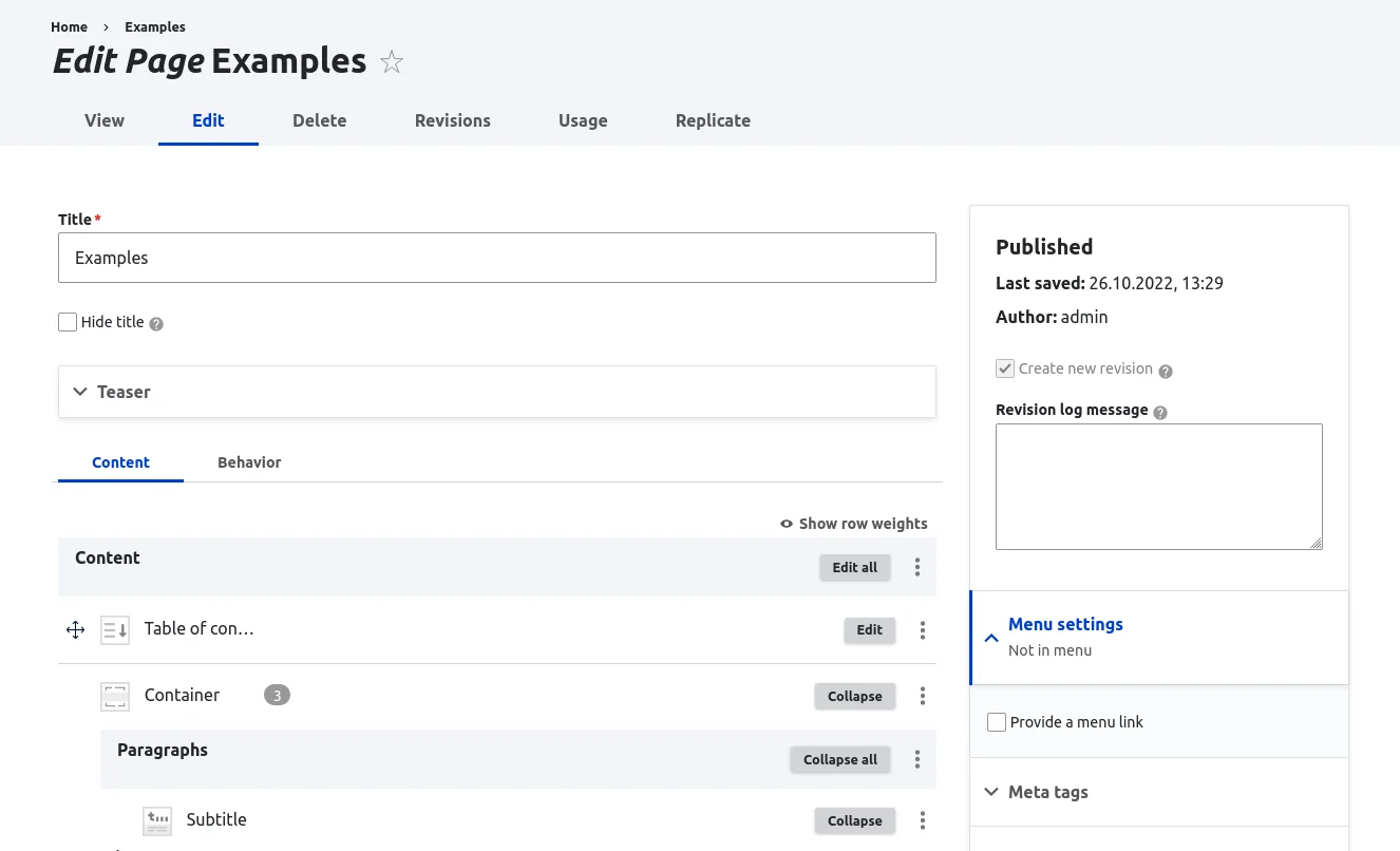
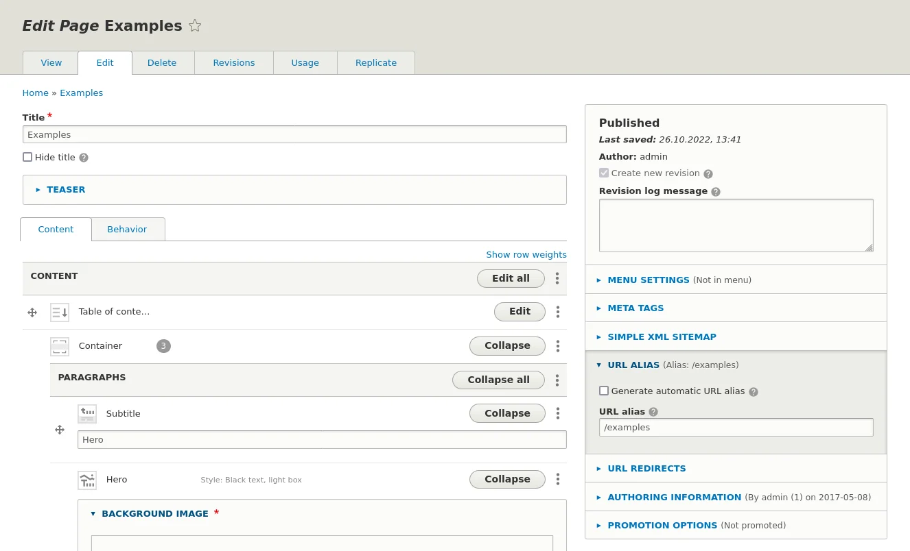
In Drupal 10, the old backend theme "Seven" is replaced by the more modern, easier to use "Claro". We are preparing this change for our customers in the background. This requires not only technical adjustments, but also a whole range of additional work. The example of the integration in Primer shows this well: In addition to a comparison of Claro with a possible alternative, multiple rounds of testing, a revised documentation, many other tasks were necessary.
In Drupal, a so-called "backend theme" is typically used so that the backend is visually different from the frontend. This theme is therefore also optimized for editing and managing content.
The backend theme (on Drupal Core) since Drupal 7 has been "Seven", in Drupal 9 there is the new theme "Claro". Claro looks modern and has better usability. In Drupal 10 Seven will be removed, so Drupal sites will have to change the backend theme before switching to Drupal 10.
In Primer, the backend theme Seven was used until now, so a change to a new theme was necessary there as well. However, there are various smaller and larger adaptations for Seven in Primer, e.g. for the paragraph UI and media management,
Evaluation process for Claro and Gin
First, we evaluated whether to use Claro or another backend theme. Besides Claro, we also looked into the "Gin" backend, which is also often used. Both themes were extensively tested in Primer. In doing so, we compared Seven to Claro and Gin on the backend and checked where there were bugs to fix. Attention was paid to whether all functions are still available and the design fits. The errors were reported in a document. After that, they were broken down into categories and whether the bug was relevant to our customers or just to us as admins. With these criteria it was then decided which backend would be better for Primer.
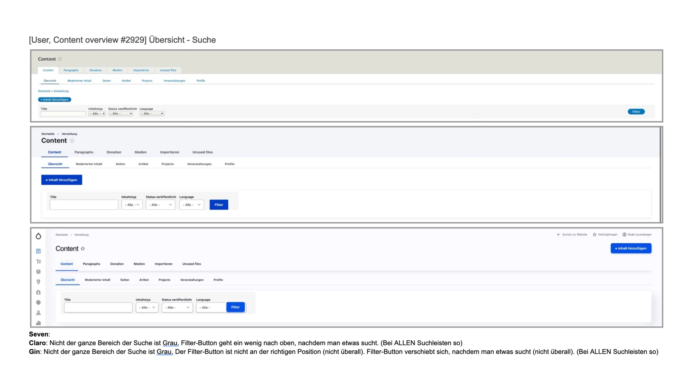
Gin has many more features, in particular the toolbar in the front and back end is also completely redesigned. However, these changes were incompatible with some modules we use as well as our own customizations, and we estimated the effort to use Gin to be significantly greater.
Therefore, we decided to go with the Claro theme, which took significantly less time to debug and integrate. However, we will re-evaluate this decision in the future, since Gin is based on Claro, most of the customizations we made can be used there as well.
Various improvements in collaboration with the community
Various Primer-specific improvements had to be made during the implementation. But there were also various adjustments that we made in Paragraphs and other modules as well as in Drupal Core itself. Often the Drupal community had already done some preliminary work on which we could build. This mutual support and willingness to cooperate is one of the great strengths of Open Source and Drupal in particular. These were partly small optimizations to the alignment and spacing of buttons and other elements, but some features such as Add Above and the Drag & Drop mode were completely inaccessible in Claro and had to be made visible again.
After the bug fixing phase, the development version of Primer was updated to Claro. This was then tested again, with the focus of on the previously reported bugs, as well as testing different browsers. A few more bugs were found and reported in a document again - this process was repeated until the result was satisfactory.
Primer 2.3 with Claro
The next Primer version (2.3) is now being finalized and we are in the process of updating our own pages first and then our customer pages with it.
In parallel we are updating all screenshots in our detailed documentation - due to our automated processes this is very efficient. In the process we have also identified some issues that were not noticed during manual testing.
